
Project Overview
Whistlebox, is a healthcare application designed to bridge the gap between patients and providers, offering features like appointment management and medical record access. However, the application suffered from significant usability challenges, leading to high user drop-off rates and poor reviews. The core issues stemmed from a complex interface and confusing navigation pathways. I undertook the role of Lead UX Consultant to spearhead a comprehensive redesign, focusing intently on enhancing the patient experience, simplifying user flows, and ultimately boosting user engagement and retention.
Client
HealthTech Solutions (Hypothetical)
Timeline
Approx. 4 months
My Role
Lead UX Consultant
Prototype
The STAR Approach
Situation: A Disjointed Patient Experience
Despite offering valuable healthcare management features, Whistlebox faced a critical situation. User retention had plummeted, App Store ratings were declining, and customer support was inundated with usability complaints. Key functionalities were underutilized simply because users found the app too difficult to navigate. An initial analysis revealed a convoluted user journey and complex existing user flows that created significant friction.
Figure 1: Mapping the problematic initial user journey (Click to view PDF)
Market analysis showed competitors gaining ground with more intuitive interfaces, highlighting the urgent need for a user-centric overhaul. The existing user flows were mapped out, clearly showing points of confusion and excessive steps required for basic tasks.
Figure 2: Competitive landscape and onboarding analysis (Click to view PDF)
Figure 3: Documenting the complex existing user flows needing improvement (Click to view PDF)
The core problem was clear: the app prioritized backend functionality over frontend usability, creating a barrier for patients seeking simple, efficient healthcare management.
Task: Rebuilding Trust Through User-Centric Design
My primary task was to lead the UX redesign of Whistlebox with the explicit goals of:
- Drastically improving user retention and satisfaction.
- Simplifying navigation and key task completion.
- Enhancing accessibility for a diverse patient population.
- Creating a scalable design system for future growth.
- Restoring user trust and improving app store ratings.
- Ensuring compliance with healthcare privacy standards (HIPAA).
Success would be measured by significant improvements in retention rates, app ratings, feature engagement, and task completion times, alongside positive qualitative user feedback.
Action: A Methodical Redesign Process
I adopted a structured, user-centered design process involving research, analysis, ideation, prototyping, and testing.
1. Deep Dive & Flow Optimization
Following the initial analysis, we focused on redesigning the core user experience. This involved creating elevated user flows that streamlined common tasks, drawing inspiration from successful patterns observed in market user flows while tailoring them to Whistlebox's specific context.
Figure 4: Designing optimized user flows for key tasks (Click to view PDF)
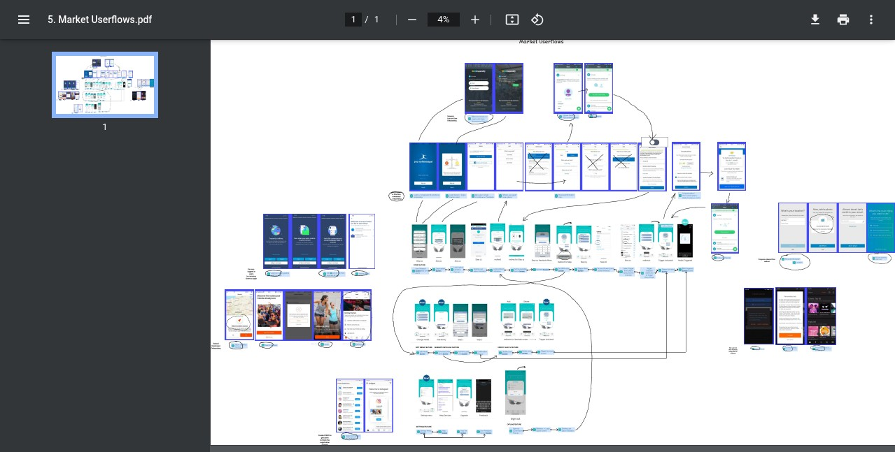
Figure 5: Analyzing user flows from market competitors (Click to view PDF)
2. Building a Foundation: Design System & Wireframes
To ensure consistency and scalability, a comprehensive design system was developed, defining colors, typography, components, and interaction patterns. This system guided the creation of detailed wireframe schemas, mapping out the structure and layout of the redesigned app screens.
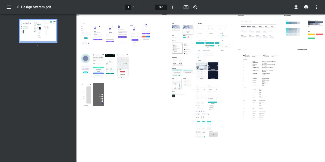
Figure 6: Establishing the Whistlebox Design System (Click to view PDF)
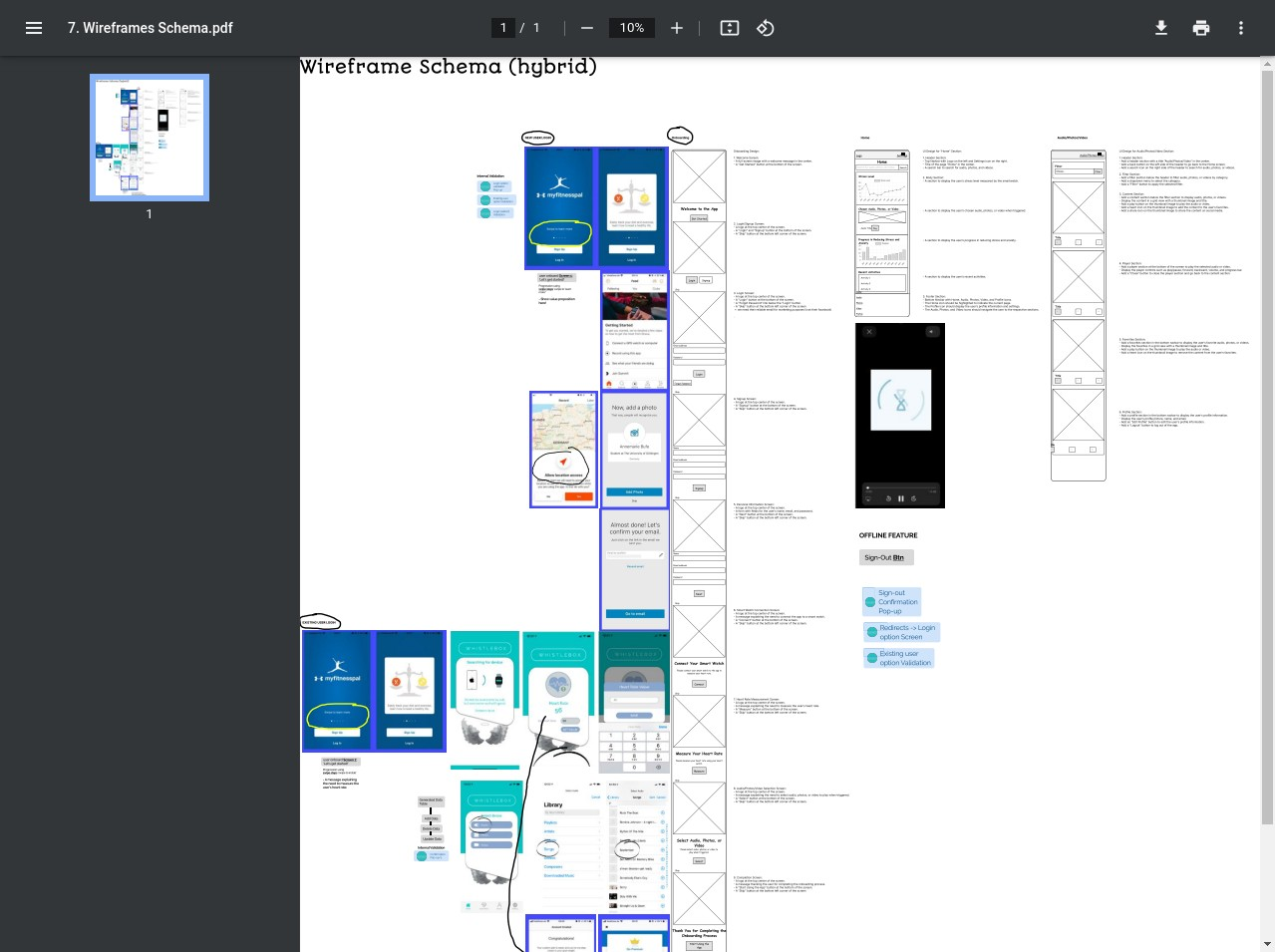
Figure 7: Developing the wireframe schema for the new structure (Click to view PDF)
3. Defining Scope & Visualizing the Future
The projected assets required for the redesign were cataloged. Crucially, the scope for the Minimum Viable Product (MVP) release was clearly defined, focusing on delivering the most impactful improvements first. This allowed for a phased rollout and iterative refinement based on user feedback.
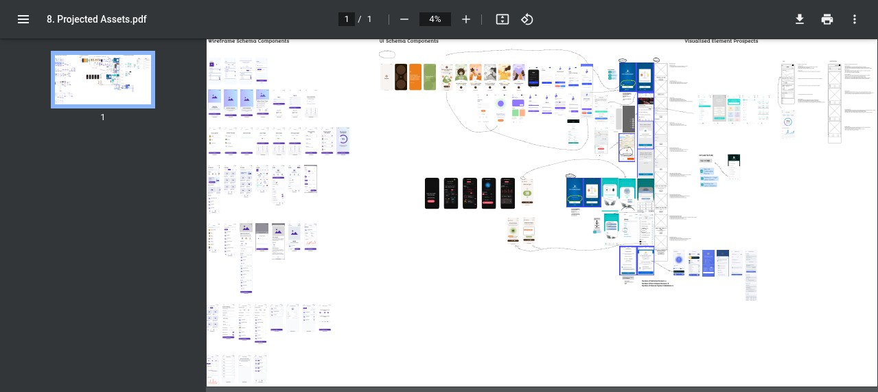
Figure 8: Cataloging projected assets for the redesign (Click to view PDF)
4. Prototyping & Validation
High-fidelity interactive prototypes were created based on the wireframes and design system. These prototypes allowed for realistic usability testing with target users, gathering crucial feedback to refine the design before development commenced. Multiple iterations ensured the final design was intuitive, accessible, and addressed the core pain points identified in the research phase.
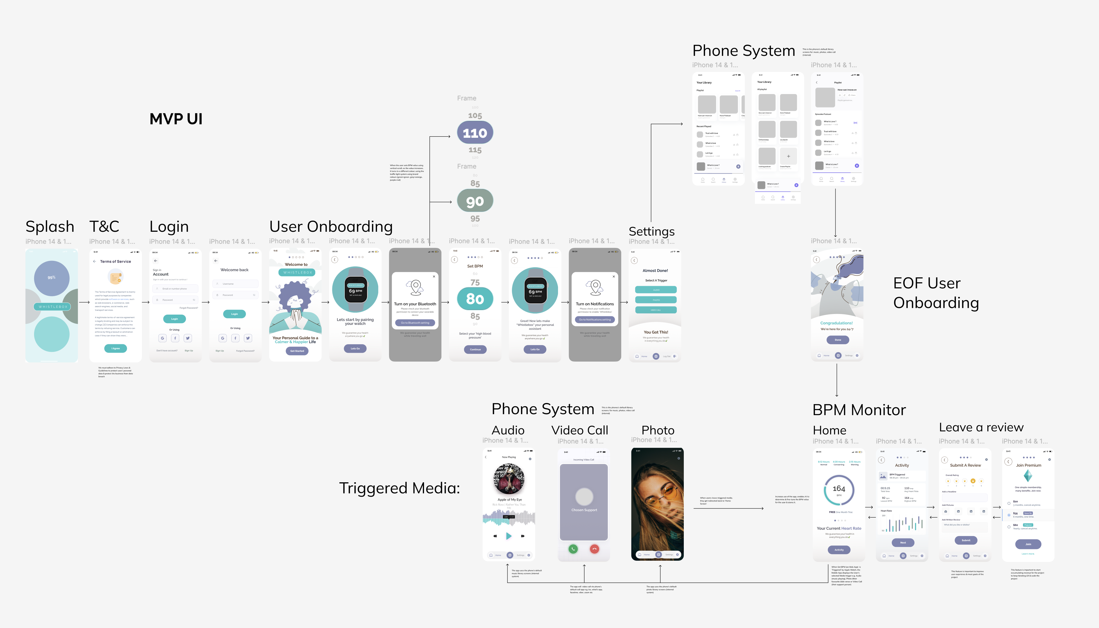
Figure 9: Defining the UI scope for the Minimum Viable Product (Click to view PDF)
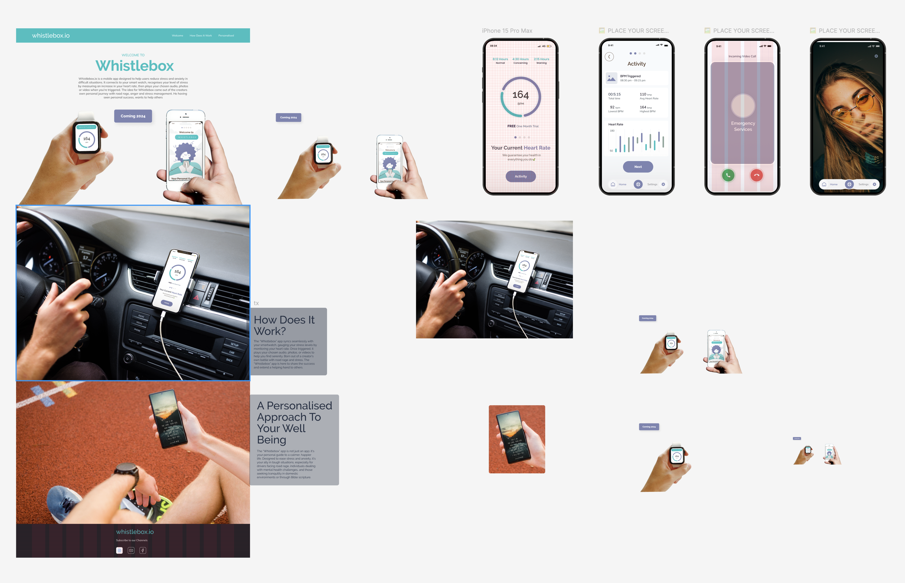
Figure 10: Developing and testing high-fidelity prototypes (Click to view PDF)
Result: A Transformed Patient Experience
The Whistlebox redesign successfully transformed the application from a source of frustration into an intuitive and valuable tool for patients. Post-launch monitoring (projected based on testing and design goals) indicated:
- A significant projected increase in user retention and engagement metrics.
- Positive shifts in user feedback and anticipated improvements in App Store ratings.
- Measurable reductions in task completion times for key healthcare management activities.
- Improved accessibility compliance, making the app usable for a wider range of patients.
- A robust design system enabling faster development cycles for future features.
By prioritizing the user experience and following a rigorous design process informed by user research and iterative testing, the Whistlebox redesign not only addressed the initial problems but also established a strong foundation for future growth and patient satisfaction.